Food'in
The "Food'in" application was designed to help users cook good, simple, and quick recipes. It also allows them to shop and order the ingredients needed for the chosen recipes. My role on this project was to design the mobile screens, as well as all the user journeys necessary to create an optimal user experience.
The context
I started working on this app on 2020, I’ve been mainly focusing on the user interface, userflows, and wireframes. I was the only designer who worked on, and I created a UI Kit for this project as well.Food'in is designed to make meal cooking more convenient and efficient for busy individuals and families. With the help of the app, users can save time and money by cooking simple meals and making sure they have all the ingredients they need on hand.
"A good recipe is always made with love ❤️ "
Designing something modern
Something interesting in this project, was that nothing has been created before I start working on it. This means, that everything was possible in terms of UI. I talked with the team members in order to collect all the informations, it was also a good opportunity to learn more about the personas, the different details about the recipes, where can I get the real data (pictures, content, title, ingredients, etc...).
My first job was to sketch some wireframes of several screens, and started to think about userflows as well

I wasn’t sure about the colors, typography, icons at this point. So in the same time I started to work on a UI Kit, I collected some insights from stakeholders, and conducted feedback sessions around explorations foundations (colors, typo, elevation, icon library). The logo was ever created before, so I had something to start on.
For the typography I used a reference figure, which is 1.12. I chose 16px as a base size and then you either multiply or divide by 1.12 in order to create a type scale consistent and visually harmonious.

When I start to design some component for a UI kit, I used to see best practices in Google material but also I try to find some inspiration on different Design system on internet. But one of the most important thing is pay attention that components should be easy to navigate and understand, with clear labels and intuitive layout. It is also important to consider the visual design, making sure that the components are visually appealing and consistent with the overall design of the app.
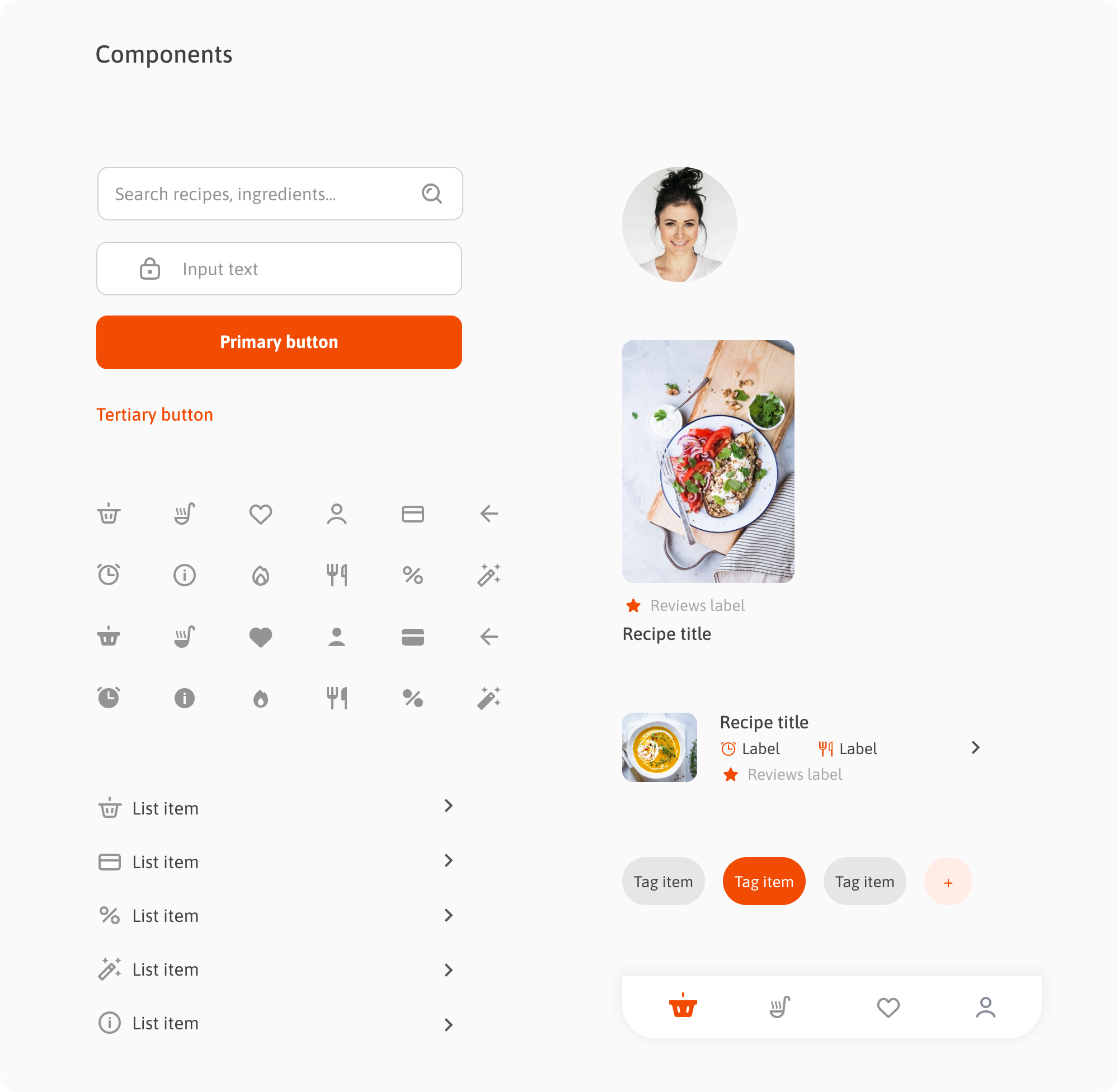
Designing consistent components for a UI kit is essential
for creating a seamless user experience and making the design process
more efficient.
Make your groceries and cook your recipes
An interesting part of this project was to design the screen with the list of recipes and a screen with the recipe itself. I went to a stock photo platform to pick some pictures I needed, same for ingredients. Actually I wanted some pictures with a light background (even empty sometimes) in order to help the user to be more focus on dishes.This work requires a good visual skill. I collected the rest of the content from the PM.
Food’in is an app for cooking and making groceries, my part of the job was mainly focused on designing the screen to cook recipes. On the mobile screen bellow, we notice that primary button invites the user to add some recipes in the basket, this will allows the user to order ingredients and manage the basket later. I wasn’t responsible for this second part of the app which has been designing much later.

Since I designed the first screens of the application, I’ll be able to tackle new tasks concerning the research within the app. A filter in a recipe app allows users to narrow down the list of recipes based on certain criteria, such as ingredient, dietary restrictions, or cooking time.
I also suggested to add some advanced filters. This, may include more specific options, such as the ability to filter by multiple ingredients or by specific cuisines. These filters can greatly enhance the user experience by helping users quickly find the recipe they are looking for.

Filters are like a compass, they guide users to their desired destination.
Manage your settings easily
Managing settings in an application is crucial for providing a seamless user experience. Easy-to-use and intuitive settings allow users to customize the app to their preferences, increasing user satisfaction and engagement. For example, in Food’in app, users are be able to easily change their search preferences.
Additionally, managing settings can also help to improve the performance and functionality of the app. For example, if the app can easily adjust the level of detail displayed in a recipe based on the user's preferences, it can reduce load times and improve the app's overall performance. Furthermore, easy management of settings can also help to ensure data privacy and security by allowing users to control how their data is being used and shared.


